EDCI

Author: rathor97 (Page 1 of 2)

The Basic’s of FPS Games

Introduction:

First Person Shooters(FPS) are a very popular type of video game genre. It is played almost all around the world and many other types of video game genres reflect from the basic controls used in FPS games. With this in mind, we decided it would be a good topic to teach so anyone who wants to get started playing video games can have a basic understanding of what is required to play and enjoy this popular genre.

Multimedia Lesson Plan: Basics to First Person Shooters (FPS)

Goal

Learners will be able to understand the basic game mechanics and controls to get started on an FPS Shooter game.

Learning Objectives

Learning objectives should be Map awareness, Basic Controls, Detecting, and Understanding different sounds.

By then end of the lesson, learners will be able to:

  1. Know their in-game surroundings such as mini-maps, location of objectives, and key stronghold areas which will result in Map awareness.
  2. Basic controls such as shooting, aiming, and movements.
  3. Being able to pick up certain sounds within the game such as enemy footsteps and callouts.

Prior Knowledge

  1. Learners will not need prior knowledge on playing FPS but learners will need prior knowledge on downloading games and the necessary hardware and software to run the game.

Delivery

  1. Presentation on the basics of Map awareness and the benefits of knowing the map layout.
  2. Interactive Video explaining the basic controls.
    1. How to move
    2. How to aim
    3. How to shoot
  3. Youtube video on the topic of understanding sound mechanics.
    1. Enemy footsteps
    2. Callouts
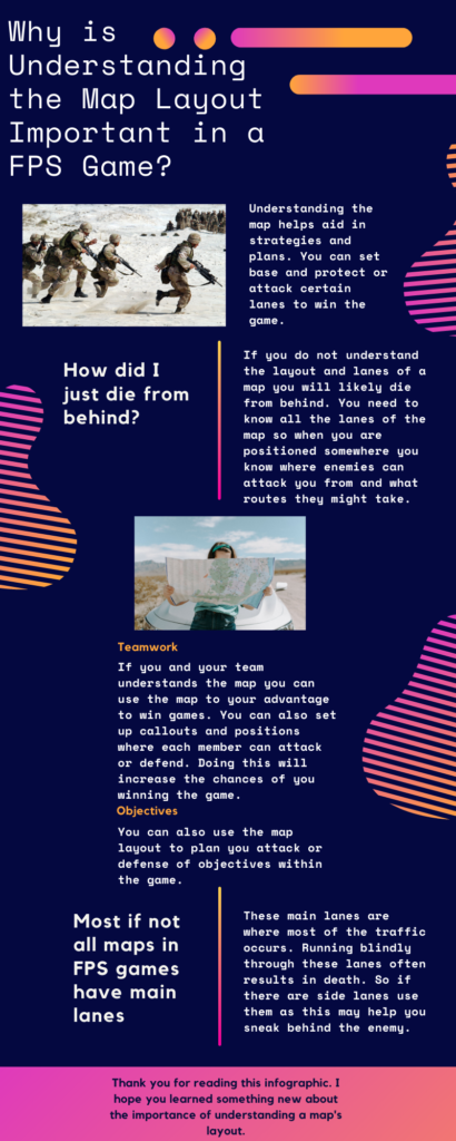
  4. Infographic highlighting the importance of map layout and how to use that to your advantage.

Evaluation

  • Learners evaluation: learners submit videos of their gameplay demonstrating the basics learned from the lesson.
  • Learner feedback survey.

FPS Basic Controls

Understanding sound Mechanic’s

Presentation and Infographic

https://docs.google.com/presentation/d/1TJnbKqrxLMeKNlE13VTUbsXZNECDA_WanDAbUqUYLLI/edit?usp=sharing
What Multimedia Principles were used in each method of Delivery

There were many multimedia principles used when creating all the multimedia deliverables. The multimedia principles used are:

  • Redundancy 
  • Segmenting
  • Personalization
  • Embodiment
  • Worked Examples
  • Feedback
  • Modality
  • Split-attention
  • Coherence
  • Signalling
  • Spatial contiguity
  • Pre-training
  • Multimedia
  • Dual Coding Theory
  • Cognitive Load Theory

The Redundancy principle was used in everything except the PowerPoint presentation. The videos and the infographic do not contain information that is constantly repeated.

The Segmenting principle was used in everything except the infographic. The videos and slideshow are presented in learner-paced segments rather than continuous units.

The Personalization principle is used only within the videos presented. This is because each video has a speaker talking about the topic at hand in a conversational style. Both the presentation and the infographic do not have a speaker so this principle does not apply. 

The Embodiment principle is used only in video presentations. This is because we only speak in the videos and we do not have our image on the screen.

The Worked examples principle is used in both videos as the speaker is explaining the content and they are also showing what these concepts may look like with gameplay. The PowerPoint has an added scenario that helps illustrate the concept to the learner. 

The Feedback principle is only shown in the basic controls video. Learners receive feedback on what they have learned from the multiple-choice and true/false questions.

The Modality principle is present in both videos as they are narrated and also have gameplay. Both the PowerPoint and infographic do not have any narration which is why this principle does not apply to them.

The Split-attention principle is shown in everything except the sound mechanic’s video. words and pictures are physically and temporally integrated.

The Coherence principle is present for all the multimedia presented as there is no extraneous material present in any of them.

The Signalling principle is shown in the basic controls video and the infographic. Cues are added that highlight the key information and its organization. The questions in the video as well as the infographic headlines show what’s important.

The Spatial contiguity principle is only present within the PowerPoint presentation and the infographic. Both the presentation and infographic have pictures that correspond to the words presented near each other, therefore this principle is present.

The Pre-training principle is shown in the lesson plan. The lesson plan showing the material that will be covered in the presentation introduces the topics and concepts before the learner is shown them within the presentation.

The Multimedia principle is applied in both the infographic and PowerPoint because both multimedia have words and pictures present not just words.

The Dual Coding Theory is shown within the videos because both visual and verbal information is used to represent information given to the learner. 

The Cognitive Load Theory is shown throughout the whole presentation of the multimedia’s because we are only going over the basic’s of FPS and not the more advanced material.
Information about Varadero!

I chose to update and screen record my experience in Varadero. This Google Earth Story shows a resort I stayed at as well as two restaurants in the Town. Having Screen recorded and presenting this Google Earth story allows for greater understanding of Cuba by having a real time presentation and facts given compared to basic information from on screen text. Some multimedia principles that I have now updated and included to improve this story are the Signalling principle which highlights the main talking points to help focus the audience to the given area as well as adding questions in the video to show feedback to the viewers to show they are following along. Another principle shown is the Modality principle. By adding narration with the graphics rather than just having animation and on screen text the audience gets a deeper understanding on this topic. With the added narration the Voice principle which is met by having my voice rather than a computer automated one as well as the personalization principle also greatly help the audience in understanding the information being presented rather than just having the story by itself. The last multimedia principle shown is the Coherence principle, I have shown this by having relevant pictures and sounds in the presentation rather than anything that can distract the viewer.

Kejia Blog Post 2

I like how you explained what was wrong with Dr.Rays powerpoint. Dr. Ray not following these principles as you explained such as Embodiment principle which made his powerpoint harder to follow. I also enjoyed the pictures you added on your post.

I wonder if you could of added some questions or comments on screen in the video to allow the viewers to show there understanding of the concept.

Overall really nice blog post! I really liked the pictures you added in your blog post! Great Job Kejia!

Hsein-wen Blog Post 2

I like how Hsien-wen chose a Ted talk that he enjoyed and was relatable to past material. This Ted talk explained The Dual Coding theory, multimedia principle, and Signaling principle as explained by Hein-wen.

I wonder if you Hein-wen could of provided an image that could of shown the seven deadly sins of speaking that could of provided more understanding to us the reader!

Overall really good blog post! i really liked the Ted Talk and you chose an entertaining presentation! great job Hein-wen!

Leland Blog Post 2

I like how Leland explained and provided examples of learning principles the presentors presented in there in presentation. An example is the signalling principle and Dr. Bavelier uses this by using underlines and arrows. Another concept i enjoyed that was covered was the Dual coding theory that Leland points out the presentor Dr.Bavelier utilizes by making mental images that connects to the lesson she is teaching.

I wonder if you Leland could of used some images in your post to connect the multimedia principles shown in the presentation that you outlined to help better prove the point they are present.

Overall really great post that connects multiple multimedia principles shown in the Ted talk! Great job Leland!

Is Sketchnoting better then regular note taking?

My bad news score was 9,897. The multimedia learning principles that the game does follow is the Segmenting principle,Multimedia principle and Personalization principle. A principle that it does not follow is the Modality principle. A way I would improve the game is by adding more options then the ones listed to provide even more different outcomes. Another way I would improve the game is by having less hints that kind of lead you on a set path rather then an open one.

https://gyazo.com/6c46bafc8a19196c25ab5e5b724ccfec (score)

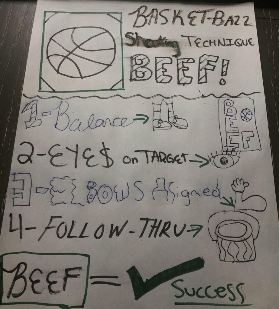
Multimedia learning principles that relate to the Sketchnotes are the Multimedia principle, words and pictures then words alone. Split-Attention principle, words and pictures are integrated. Redundancy principle, isn’t presented in one or more formats.Signalling principle, cues are added by picking out information. Spatial contingency principle, words and pictures are presented near eachother. Finally the Segmenting principle, message is presented in learner paced segments.

BEEF

Sketchnoting could be helpful by providing not only text but also images to help compliment the information being learned. Having the image in thought can help remember information about it. The downside is the images take time to draw and notes need to be revised, in actual classes there is not enough time to draw images let alone sometimes the text given. Sketchnotes are better then regular note taking in my opinion if there is time to add the images.

Learning Methods we use in EDCI 337 are Active and Passive.

Lowry is A Raptors Icon

Redundancy Principle

Spatial Contiguity Principle 

Temporal Contiguity Principle

Modality Principle

Multimedia Principle

Personalization Principle

Voice Principle

Image Principle

Core Multimedia Skills in Fl Studios A3

The Multimedia objectives I have updated in my recasted video are the Pre-training Principle, Voice Principle, Worked Example Principle, and Coherance Principle. In regards to the Pre-Training principle I introduced the sounds of Snares, Clap and Kick to help the learner know the difference and familarize the sounds with the example of the sounds all together given in the video. The Voice Principle I made sure to use my own voice over rather then an automated one to give the learner a sense of comfort to show that the presenter is presenting there own work in real time rather then with automation. With the Worked Example Principle I provided the learners with an assignment to work at with only adding Kicks and Snares. This allows the learner to test there knowledge and show they know the difference between the sounds. In regards to the Coherance Principle I did not add any sound effects or anything to distract the learner from the information given from the video. This helps the learner keep focus and relate to the material a lot better. The updates in the details of the new questions in H5P added in the video allows the learner to test there knowledge of what they have learned so far in the video. The questions are given at a timely manner so the information has already been presented. With these new updates the learner is provided with a much better video tutorial then the first one intially given. Things to improve could be adding more worked examples to show more of the software and it’s features.


Kira Cao, Understand and use The Multimedia Principles

Understand and use the multimedia principles

I liked how you cleary supported your claim on how Dr.Ray did not follow the Modality Principle. His voice was not clear as you stated so the learning benefits of the narration aspect of this principle along with images is not followed. I also liked how you used an example from your past powerpoint presentation to show the Signaling principle by pointing out the images in your provided pictures.

I wonder if, in addition to your excellent blog post could you have maybe better defined how the Feedback Principle might help the learners by giving them positive/negative feedback on their performance for example from an assignment given by the instructor rather then questions being answered face to face.

Overall great post with nice images and references to Multimedia Priniciples!

Hsien-wen Kuo Multimedia Design for learning

Blog 3-Multimedia Design for Learning

I liked how you used a past experience in your blog post to help show your understanding of the topic.  I agree with the statement of “we can sometimes change a word, it would make people to think in other way” with a change of a single word a whole different direction can be taken from the one someone may be trying to state. The video you have provided of the homeless gentlemen helps prove your point across more by showing the importance of words.

I wonder if, in addition to your great blog post could you have maybe gone more in depth of the relevancy or provided an example/ connection of principles you stated above in the introduction such as the Modality and Redundancy principle to your post.

Great job Hsien-wen on your blog post!

« Older posts

© 2024 rathor97

Theme by Anders NorenUp ↑